Introducing MUI X v8
José Freitas
@joserodolfofreitas
We are excited to announce the stable release of MUI X v8.0.0—packed with many new features, native ESM support alongside Material UI v7, and an improved license management experience.
Table of contents
- Data Grid
- Date and Time Pickers
- Tree View
- Charts
- Enhanced License management and Telemetry
- Priority Support – a new support service
- Support for Material UI
- Migration guide
- Long-term support (LTS)
- What's next
- How to get involved
Data Grid
Pivoting
The wait is over! With pivoting, your users can easily restructure and summarize large datasets: group related data, calculate aggregates (such as sums, averages, and counts), and compare different data categories side by side. This flexibility enables faster insight discovery and more efficient data analysis.
This feature is available right out of the box, but you can also create a preconfigured setup to tailor it to your user requirements.
Check out the Data Grid pivoting documentation to learn more.
Ask Your Table - AI assistance in the Data Grid
After a testing period with pilot users and customers, we're excited to introduce our new AI Assistant for the Data Grid: Ask Your Table.
Now your users can interact with data using natural language queries and extract data insights faster than ever.
For example, if you're working with an Olympics medal dataset, you can simply ask, "Who won the most gold medals this century?" and the Data Grid will automatically apply the right filters, groupings, and aggregations to display your answer—all while keeping your dataset private.
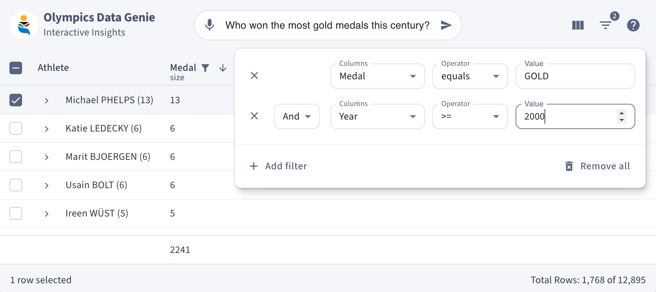
Fully customize your own UI for direct input, or use the AI Assistant panel—featuring question history, detailed view of the applied changes, and conversation threads.
Key benefits:
- Enhanced usability: Simplify interactions with data by asking questions in plain language.
- Unlock the full potential of the Data Grid: Explore, combine, and discover powerful data analysis features often hidden behind menus, without having to hop from one menu to another.
- Data privacy: No need to share your dataset—the service model only requires your column definitions and a few data samples.
Interested in bringing this feature to your users? Contact us to get your API Key!
List view
We've promoted List view to stable, and over this major we're committed to enhancing this feature even further—making it easier to deliver a robust Data Grid experience on small screens.
Learn more about List view.
Server-side Aggregation and Lazy loading
The Data Source now supports advanced features such as server-side aggregation, on-demand data fetching for infinite scrolling, and lazy loading.
Explore all your options when handling Server-side data.
Data Source with support for editing
Our Data Source now includes an optional updateRow() method to facilitate server-side data updates. This method returns a Promise that resolves when the row is successfully updated. On success, the grid updates the row and automatically clears the client-side cache to ensure that no outdated data is displayed. If an error occurs, the onDataSourceError callback is triggered with an error object containing the update parameters, as detailed in the Error Handling section.
Here's an example of a Data Source configuration with editing support:
const dataSource: GridDataSource = {
  getRows: async (params: GridGetRowsParams) => {
    // Fetch rows from the server
  },
  updateRow: async (params: GridUpdateRowParams) => {
    // Update row on the server
  },
}
For more details, please refer to the Updating Data page.
Data source on the Community Plan
Great news—the Data source move from the Pro Plan to the Community Plan (MIT licensed)!
We're unifying our approach to handling server-side data across all plans, creating a single, cohesive framework.
Explore your options in our Data source docs.
Row spanning
Row spanning has also been promoted to stable, providing a reliable and flexible solution for merging cells across multiple rows. This enhancement makes it easier to create complex, multi-row layouts within your Data Grid, allowing you to present your data more effectively.
Learn how to set up and use Row spanning.
New Toolbar
The redesigned toolbar not only looks fantastic but also empowers developers one step further through an open composition of subcomponents, allowing you to tailor the toolbar's layout precisely to your application's needs.
This new developer experience, based on composition, may feel different from our previous approach—but it sets a new standard. We'll soon extend this enhanced experience to other key subcomponents, such as the filter panel and columns management panel, ensuring a cohesive and powerful toolkit for advanced customization.
Dive into our new docs section on Components usage.
No columns overlay
We've added a no-columns overlay to serve as a clear fallback when the Data Grid has no columns to show.
Learn more in the No columns overlay documentation.
Date and Time Pickers
Time Range Picker
It's finally here! The highly anticipated Time Range Picker component is designed for a straightforward and efficient experience, perfect for scheduling applications and detailed period inputs.
Get started with the Time Range Picker.
New view-switching strategy
We've removed the automatic view-switching in the Date Time and Time Range Pickers to deliver a more consistent and user-friendly experience.
Now, you can easily customize the input flow behavior to better suit your application's needs.
Learn more in the Time Range Picker docs.
Clear ownerState for slots
We've refined our slot system by clearing the ownerState before passing props to slot components.
This ensures that only the necessary properties are forwarded—resulting in a cleaner API, reduced prop clutter, and enhanced performance.
By isolating internal state from presentation layers, you gain more predictable styling and greater control when customizing components.
Accessible DOM structure
The Accessible DOM structure is now the default for our field components. The new structure ensures screen readers can correctly work with the fields.
Keyboard editing on mobile Pickers
We've introduced keyboard editing support for mobile pickers. Users can now seamlessly input and adjust date and time values directly via on-screen keyboards, providing a more accessible and efficient experience.
Tree View
Lazy loading children
We've enhanced the Rich Tree View with a robust lazy loading mechanism for children. Now, children are loaded on demand—reducing initial load times and improving performance when working with extensive hierarchical data. This approach ensures a smoother user experience and also minimizes unnecessary network overhead.
Learn how to add Lazy loading to your application's Tree View.
Performance improvements in re-rendering
We've optimized the Tree View to update only the parts that need changes, rather than re-rendering all items. With the use of selectors to precisely target nodes for re-rendering, we've achieved a significant performance boost. In upcoming releases, we'll make another big step with the introduction of virtualization.
Automatic selection propagation
The Rich Tree View now supports parent/child selection propagation. This means you can select a parent and automatically select all of its children, and vice versa—depending on your requirements and configuration.
type TreeViewSelectionPropagation = {
  descendants?: boolean; // default: false
  parents?: boolean; // default: false
};
You can learn more in the Selection docs.
New customization hook
We've officially transitioned to a new developer experience for customizing Tree Items for the Rich Tree View. With our new customization hook, you can freely compose your Tree Item while still leveraging all the out-of-the-box features of the Rich Tree View. This provides unparalleled flexibility to tailor your tree components to your project's unique requirements.
const CustomTreeItemComponent = React.forwardRef(function CustomTreeItemComponent(
  { id, itemId, label, disabled, children }: TreeItemProps,
  ref: React.Ref<HTMLLIElement>,
) {
  const treeItemData = useTreeItem({ id, itemId, children, label, disabled, rootRef: ref });

  return (
    <TreeItemProvider {...treeItemData.getContextProviderProps()}>
      <TreeItemRoot {...treeItemData.getRootProps()}>
        <TreeItemContent {...treeItemData.getContentProps()}>
          <TreeItemLabel {...treeItemData.getLabelProps()} />
        </TreeItemContent>
        {children && <TreeItemGroupTransition {...treeItemData.getGroupTransitionProps()} />}
      </TreeItemRoot>
    </TreeItemProvider>
  );
}
Learn more this and other options on Tree Item Customization docs.
Charts
Funnel Charts
We have expanded our chart portfolio with the addition of Funnel Charts, providing a new way to visualize data conversions and drop-offs.
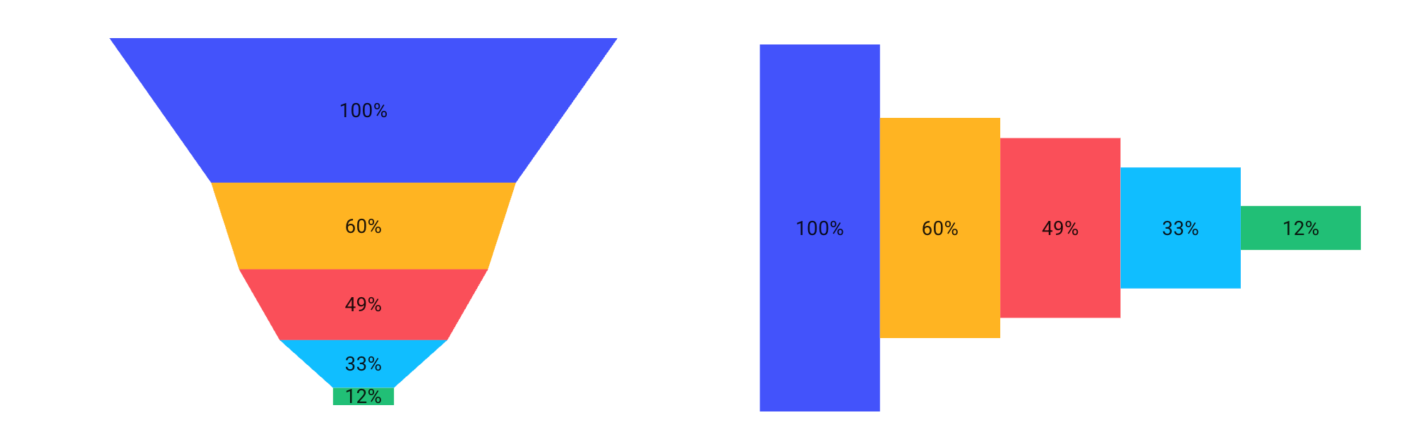
You can learn more in the Funnel docs.
Radar Charts
Similarly, our Radar Charts offer a dynamic way to display multivariate data, enhancing your users data analysis capabilities.
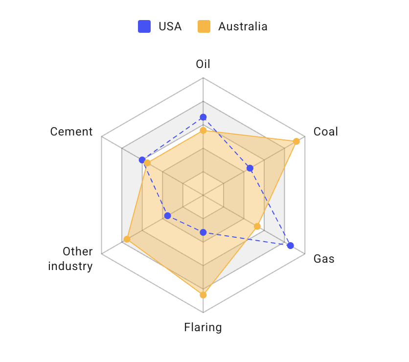
You can learn more in the Radar docs.
New animation engine
We've replaced React Spring with our very own animation engine, designed for optimal performance and full support—including guaranteed compatibility with React 19 and future releases. By building our own solution, we can ensure reliable support and provide continuous improvements tailored to the specific needs of our components.
Server-side rendering for Charts
You can now leverage server-side rendering (SSR) for charts to improve initial load performance and SEO. SSR is supported under two conditions:
- Dimensions: You must provide explicit
widthandheightprops, as the SVG dimensions cannot be computed on the server. - Animations: Animations must be disabled using the
skipAnimationprop; otherwise, the chart may render in an empty state on the initial render.
Refined design and interaction
Charts in MUI X v8 have been enhanced for greater clarity and interactivity. We've refined the default palettes, improved tooltips, and optimized legends display.
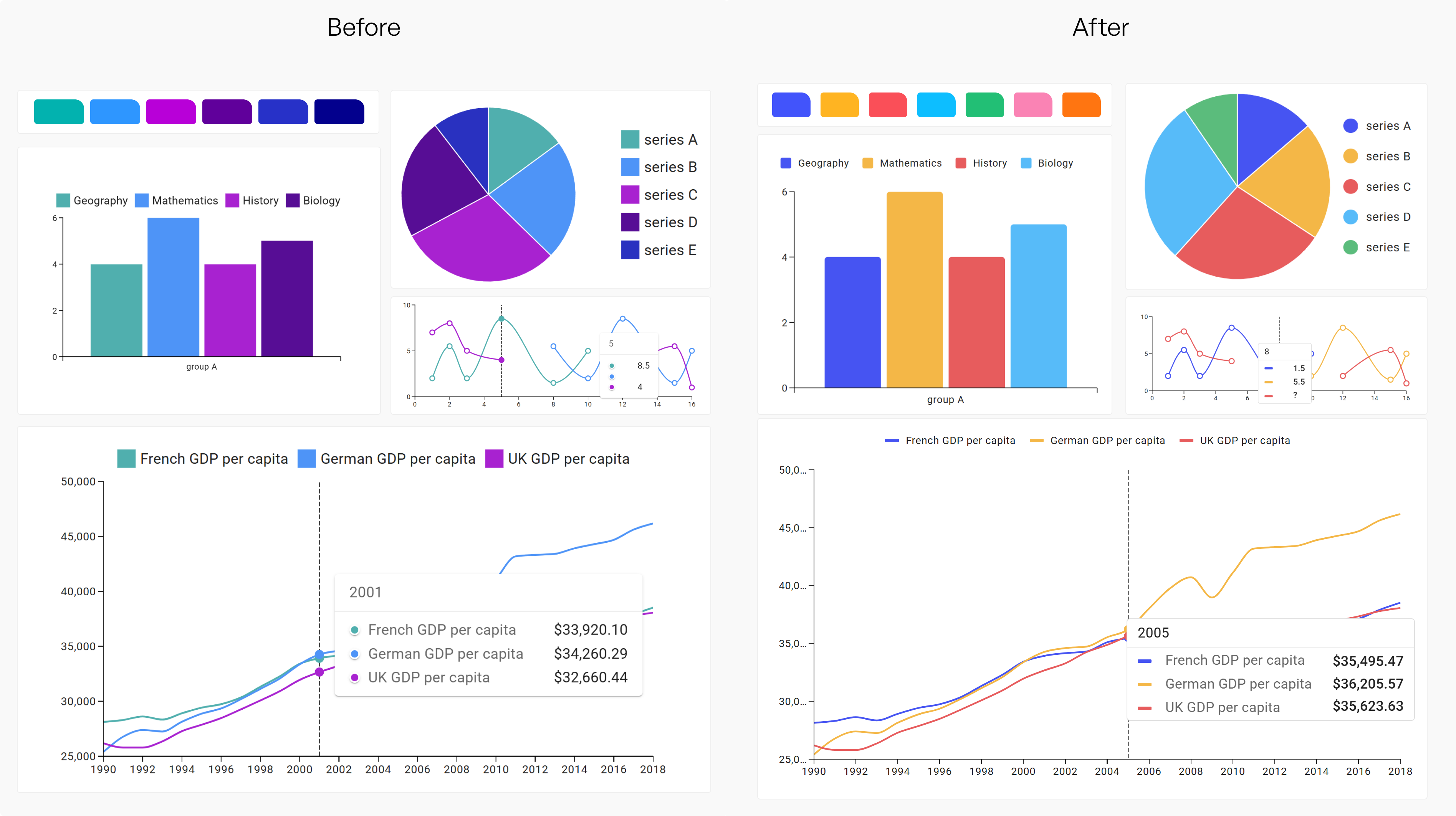
HTML Legend for Charts
We've re-engineered the charts legend so that it's now rendered as a native HTML element. This change gives you more control over its styling and behavior, making it easier to integrate with your design system.
Charts composition
We've restructured our charts composition by dividing responsibilities between two dedicated components: <ChartDataProvider /> and <ChartsSurface />.
The <ChartDataProvider /> now focuses solely on managing and processing your chart data, while <ChartsSurface /> is dedicated to rendering the visual aspects.
This clear separation enhances customization, improves performance, and offers a more flexible integration with your application.
Learn more in our Charts composition documentation.
Enhanced License management and Telemetry
Managing your license has never been easier. Our redesigned account page in the store allows you to view your license keys, update number of seats, renew, upgrade, and more.
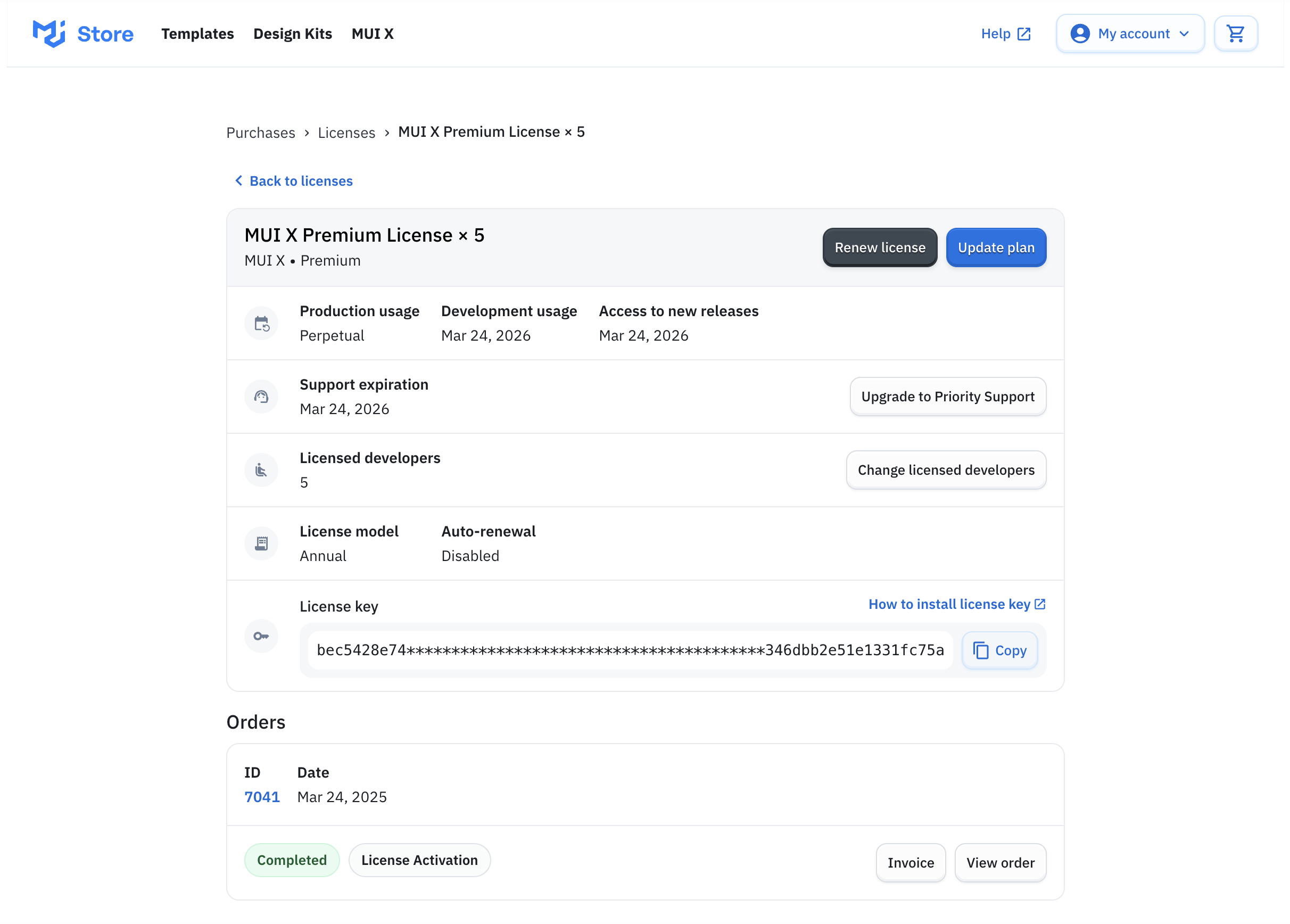
In addition, we've integrated telemetry into our system to continuously enhance your experience with our products. Using this same infrastructure, you'll soon be able to manage your license without changing your key—thanks to server-side license validation.
Telemetry is released as an opt-in feature. We recommend enabling it by adding the following code to your project, close to your license validation:
import { muiXTelemetrySettings } from '@mui/x-license';

muiXTelemetrySettings.enableTelemetry();
You can find more details in our telemetry guide.
Priority Support – a new support service
A few months ago, we launched Priority Support with a few customers, and now we're excited to invite more users to take advantage of this service.
Priority Support offers fast, dedicated assistance with guaranteed response times, ensuring that technical issues across MUI's full product suite are addressed swiftly and efficiently.
For full details on the benefits and service levels of Priority Support, please see our Support SLA.
If you're interested in upgrading to Priority Support, don't hesitate to contact our sales team for more information or purchase it directly through your account page.
Support for Material UI
When planning this major release, our goal was to support the last two major versions of Material UI. However, we faced a tough choice: continue supporting older versions (v5 and v6) out of the box, or fully embrace the step forward with Material UI v7. With improved ESM support and seamless integration with modern bundlers like Vite and webpack, v7 represents the future of Material UI. Supporting both simultaneously wasn't feasible, so we chose to move forward.
As a result, MUI X v8 only supports Material UI v7 by default. We understand this change could present a challenge, but migrating to v7 has been designed to be as smooth as possible, with comprehensive migration guides and GitHub support to assist you every step of the way.
For users who want to upgrade to MUI X v8 while remaining on an earlier version of Material UI, we've prepared a guide on usage with Material UI v5/v6.
Migration guide
We've published migration guides for Material UI and each of the advanced components. These guides detail every breaking change from previous versions with the recommended approach to fix them. We care deeply about providing a smooth migration, so it's been a top priority for us when planning our new major versions.
Please refer to the migration instructions for each individual component below:
Long‑Term Support (LTS)
Great news—our LTS policy just doubled to two full years! 🎉 As we release MUI X v8, v7 enters long‑term support, and instead of retiring v6, we're extending its LTS window by an extra year. You'll continue to receive critical bug fixes, security patches, and regression updates while you transition to v8.
For full details, see our Supported Versions page.
What's next
Our roadmap for MUI X remains ambitious. In the coming months, we'll continue delivering significant improvements and feature enhancements, including:
- Charts and Data Grid integration: Deeper interoperability for cohesive data visualization.
- Further customization based on composition: Expanding our composable architecture for even more flexible customization.
- Increased leverage of AI: Harnessing advanced AI for better insights and streamlined data analysis.
- Design and usability improvements: Continuous refinements to enhance the overall user experience.
- More improvements to server-side integration: Ongoing improvements for robust performance and scalability.
- New components: We're exploring additions that support complex planning and time-based workflows, starting with early explorations into Scheduler and Gantt components.
How to get involved
Your input drives our innovation. Join our GitHub community today to share your insights, report issues, and help shape the future of MUI X.